TL; DR: I wrote a macOS app called Lifetiler that can be used to chart your life with an emoji or colour for each day, and you can download it here.
If you’ve been following me for a while, you know I was in a long-distance relationship with Joey Marianer for several years. We met on JoCo Cruise, communicated a lot on FaceTime, and visited each other a few times a year when possible. Eventually we got married, and two and a half years later we moved in together.
On 7 August 2022, I had several hours to spare in an airport business lounge after Joey had left, so I started writing an app called Lifetiler to chart how many days we’d been together in-person. As I write this on 12 November 2024, we’ve been together in-person for 323 days of the 2811 days we’ve known each other, in 15 contiguous stretches. That makes this our 14th date, since we didn’t start dating until the second time we met. We’re on track to have been together in-person for 365 days on December 24.

But I digress. I don’t need to keep track in the app any more, because we live together! But I’ve continued working on the app to make it usable for people who aren’t me, and now it’s on the App Store. For now it’s $2.99 in the US store, because that’s <3, which makes a heart. ❤️ Whether the price stays that low depends on how soon I get a day job.
In the app you can date ranges with colors or emoji indicating what happened on those days. You can then export a chart as an image or a series of emoji. You can choose how many days to show per row or column, and the app will suggest numbers that will give you a full rectangle without gaps at the end. Here is an image chart of Joey’s and my first 256 days together in-person:
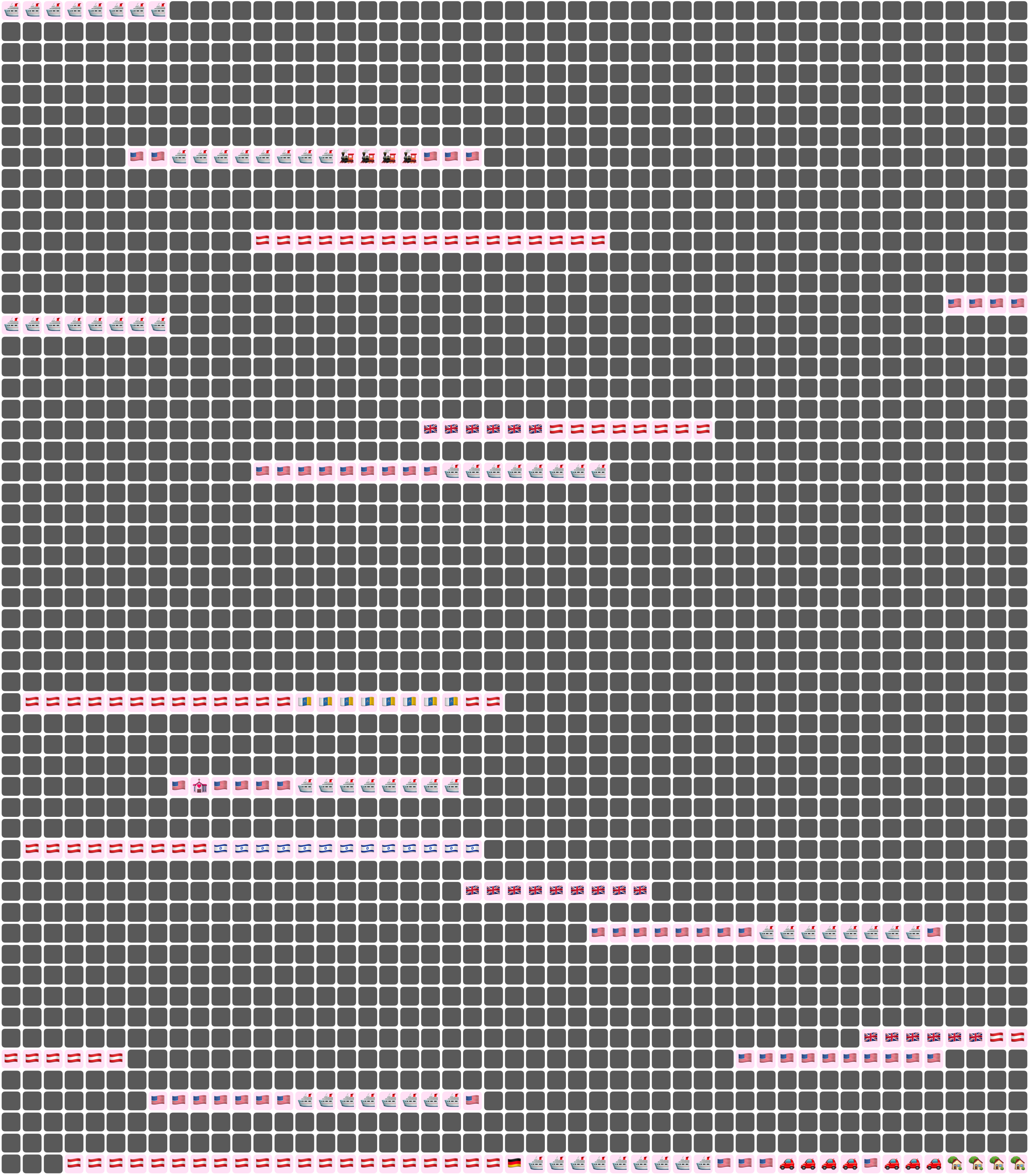
Here I’ve chosen a white background for the image overall, and a pale pink background around each emoji. Dates where we weren’t together (i.e. dates which aren’t included in any date ranges) are dark grey squares.
In an text (emoji) export, colours will be converted to the closest square emoji. I’m not going to paste the emoji version of the Joey document inline because it’s quite large, but here it is as a file:
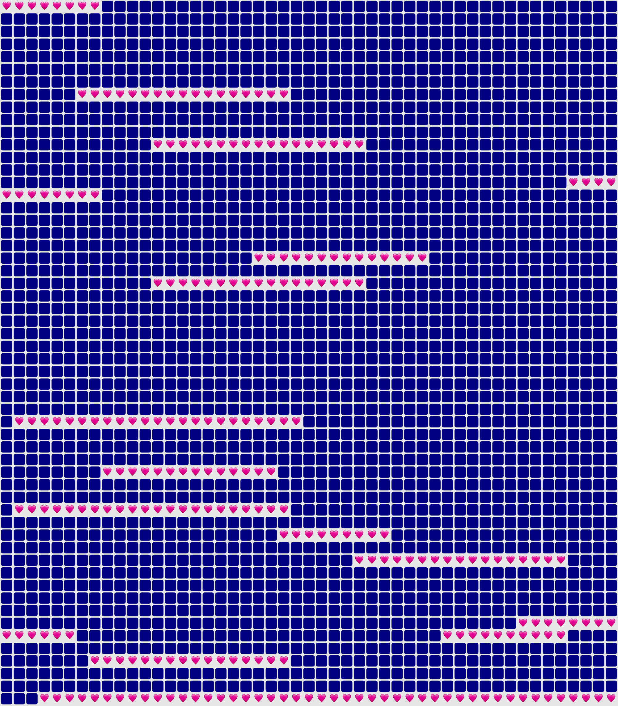
It’s also possible to show the same document in a ‘simplified’ mode, with the same colour or emoji for all days that are within date ranges — so in our case, I used a heart for every day we were together. In this chart I used light grey background for the whole thing, no background for individual emoji, and blue squares for the days we weren’t together:
You could use Lifetiler to chart long-distance relationships, where you’ve traveled, daily progress towards goals, the timeline of a novel you’re writing, a roster, your moods, symptoms, or anything you can reduce to an emoji or colour per day. It’s a document-based app, so you can have separate documents for whatever you want to chart. I’d be quite interested in knowing what you use it for! If you’re unsure what the most important thing to show on a given day is, you can have overlapping date ranges, so there’d be more than one emoji or colour on a given day, then choose which one you want shown in an emoji or image export.
I developed Lifetiler as a multi-platform SwiftUI app, which means I can easily make an iOS version which will open the same documents. That’s one of the next things on my to-do list, but since I’ve personally been using the app mainly on macOS, I would like to do substantial testing on iOS before I release it.
Here’s that App Store link again so you don’t have to go looking for it now that you know what the app does. Enjoy!


