Posts Tagged SwiftUI
Lifetiler for iOS and iPadOS
Posted by Angela Brett in My Software on July 3, 2025
TL; DR: Lifetiler now works on iOS and iPadOS as well as macOS, and is available on the App Store for macOS 15 and iOS 17 and above.
In November, I released Lifetiler for macOS, an app I wrote to keep track of which days Joey and I were together in-person — like the contribution graph on GitHub, but with more information. It’s a SwiftUI multiplatform app, which means it could always, in theory, run on iPhone and iPad, but during the initial development I mostly only tested it on macOS, so I didn’t want to release the iOS version until I’d tested it more to make sure it adapted well to the iPhone and iPad worlds.
After releasing the macOS version, I got distracted by another app I wanted to write (so many apps, so little time!) Recently it occurred to me that if I should happen to get a job at a company that has rules about what its employees can do on the App Store, I should try to publish my apps before any such rules apply to me. And I knew it would be quicker to make an iOS version of Lifetiler than to finish the other app, so that’s what I should do first. So I did! Here’s how it looks on iPhone. You can see more screenshots of Lifetiler on macOS, iOS, and iPadOS on the relevant App Stores and on the Spondee Software page for Lifetiler.

Editing a date range on the List tab on iPhone 
The Grid tab on the iPhone showing a square or emoji for each day 
Export as Image on iPhone. Usually there would be suggestions for the number of tiles per row/column that would leave no blank spaces at the end, but Joey and I had known each other for a prime number of days when I took this screenshot. 
Lifetiler could be used as a lo-fi period tracker — the data stays wherever you save the document
It turned out quite a few things needed to change for the app to work well on iOS, so it wasn’t as quick as I’d hoped. Also, my 2017 iPad Pro only runs iOS 17, not 18, so I had to make sure it would work on the slightly older OS.
Along the way I added the ability to save the background colours used in an image export, and made some improvements to the VoiceOver and Dark Mode interfaces, as well as the performance (I have James Dempsey’s Instruments course to thank for that, although my slowish iPad also helped.) These changes also affect the macOS version, so I’ve released version 1.1 for macOS as well. The iOS version is also 1.1, for consistency, although it’s the first version of it I’ve released. Hey, if all Apple’s OSes can jump to v26 simultaneously, I may as well.
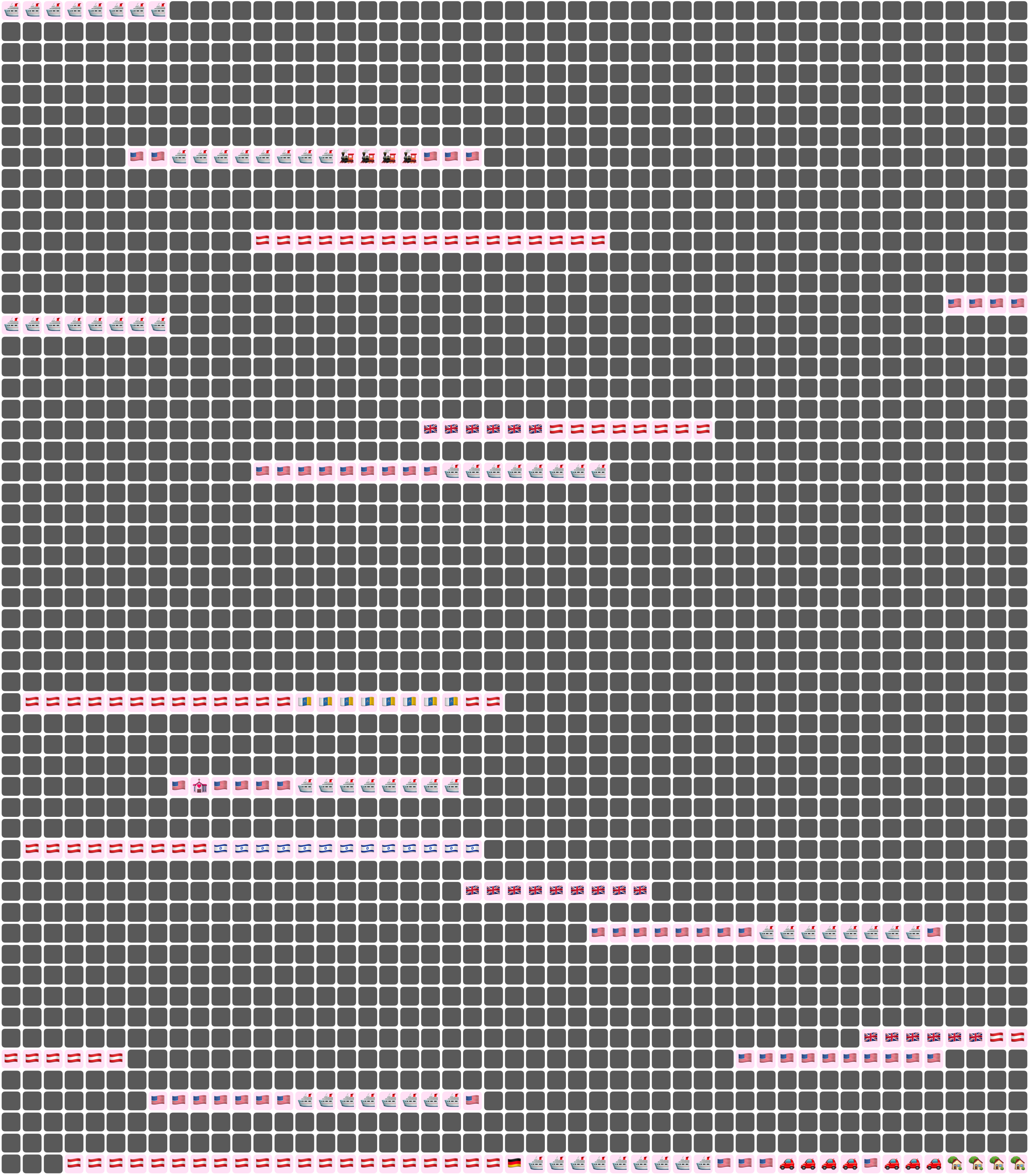
But app updates are nothing without life updates, so here’s an updated Lifetiler chart of Joey’s and my relationship, as created by Lifetiler on my iPhone 12 Pro. Check out all those 🏡 emoji at the end where we live together! I suspect some date ranges were slightly altered as I was testing the app on various platforms, but it’s close enough. Currently the only divisors of the number of days we’ve known each other are 17 and 179, so I went for a square-ish image with some empty space at the end. It is possible to change the start and end dates in the Document Settings to avoid empty space, but I wanted this one to have the actual number of days we’ve known each other.

In case you’re wondering, we’ve been together in-person for 533 of the 3043 days we’ve known each other, in 17 contiguous stretches — so since we didn’t start dating until the second time we met, this is technically our 16th date. This is getting serious! Anyway, go check out the app! You get both the macOS and iOS versions in the same purchase.
Oh, one more thing: I’ve also made some small updates to my iOS-only apps NastyWriter and NiceWriter, just to update their contextual menus to be more in line with the current iOS.
Lifetiler for macOS: it’s like a temperature quilt for your life
Posted by Angela Brett in My Software on November 13, 2024
TL; DR: I wrote a macOS app called Lifetiler that can be used to chart your life with an emoji or colour for each day, and you can download it here.
If you’ve been following me for a while, you know I was in a long-distance relationship with Joey Marianer for several years. We met on JoCo Cruise, communicated a lot on FaceTime, and visited each other a few times a year when possible. Eventually we got married, and two and a half years later we moved in together.
On 7 August 2022, I had several hours to spare in an airport business lounge after Joey had left, so I started writing an app called Lifetiler to chart how many days we’d been together in-person. As I write this on 12 November 2024, we’ve been together in-person for 323 days of the 2811 days we’ve known each other, in 15 contiguous stretches. That makes this our 14th date, since we didn’t start dating until the second time we met. We’re on track to have been together in-person for 365 days on December 24.

But I digress. I don’t need to keep track in the app any more, because we live together! But I’ve continued working on the app to make it usable for people who aren’t me, and now it’s on the App Store. For now it’s $2.99 in the US store, because that’s <3, which makes a heart. ❤️ Whether the price stays that low depends on how soon I get a day job.
In the app you can date ranges with colors or emoji indicating what happened on those days. You can then export a chart as an image or a series of emoji. You can choose how many days to show per row or column, and the app will suggest numbers that will give you a full rectangle without gaps at the end. Here is an image chart of Joey’s and my first 256 days together in-person:
Here I’ve chosen a white background for the image overall, and a pale pink background around each emoji. Dates where we weren’t together (i.e. dates which aren’t included in any date ranges) are dark grey squares.
In an text (emoji) export, colours will be converted to the closest square emoji. I’m not going to paste the emoji version of the Joey document inline because it’s quite large, but here it is as a file:
It’s also possible to show the same document in a ‘simplified’ mode, with the same colour or emoji for all days that are within date ranges — so in our case, I used a heart for every day we were together. In this chart I used light grey background for the whole thing, no background for individual emoji, and blue squares for the days we weren’t together:

You could use Lifetiler to chart long-distance relationships, where you’ve traveled, daily progress towards goals, the timeline of a novel you’re writing, a roster, your moods, symptoms, or anything you can reduce to an emoji or colour per day. It’s a document-based app, so you can have separate documents for whatever you want to chart. I’d be quite interested in knowing what you use it for! If you’re unsure what the most important thing to show on a given day is, you can have overlapping date ranges, so there’d be more than one emoji or colour on a given day, then choose which one you want shown in an emoji or image export.
I developed Lifetiler as a multi-platform SwiftUI app, which means I can easily make an iOS version which will open the same documents. That’s one of the next things on my to-do list, but since I’ve personally been using the app mainly on macOS, I would like to do substantial testing on iOS before I release it.
Here’s that App Store link again so you don’t have to go looking for it now that you know what the app does. Enjoy!
Some Statistics About My Ridiculous YouTube Channel
Posted by Angela Brett in News, video on May 3, 2020
I’ve developed a bit of a habit of recording entire concerts of musicians who don’t mind their concerts being recorded, splitting them into individual songs, and uploading them to my YouTube channel with copious notes in the video descriptions. My first upload was, appropriately, the band featured in the first image on the web, Les Horribles Cernettes, singing Big Bang. I first got enough camera batteries and SD cards to record entire concerts for the K’s Choice comeback concert in Dranouter in 2009, though the playlist is short, so perhaps I didn’t actually record that entire show.
I’ve also developed a habit of going on a week-long cruise packed with about 25 days of entertainment every year, and recording 30 or so hours of that entertainment. So my YouTube channel is getting a bit ridiculous. I currently have 2723 publicly-visible videos on my channel, and 2906 total videos — the other 183 are private or unlisted, either because they’re open mic or karaoke performances from JoCo Cruise and I’m not sure I have the performer’s permission to post them, or they’re official performances that we were requested to only share with people that were there.
I’ve been wondering just how much I’ve written in my sometimes-overly-verbose video descriptions over the years, and the only way I found to download all that metadata was using the YouTube API. I tested it out by putting a URL with the right parameters in a web browser, but it’s only possible to get the data for up to 50 videos at a time, so it was clear I’d have to write some code to do it.
Late Friday evening, after uploading my last video from JoCo Cruise 2020, I set to writing a document-based CoreData SwiftUI app to download all that data. I know my way around CoreData and downloading and parsing JSON in Swift, but haven’t had many chances to try out SwiftUI, so this was a way I could quickly get the information I wanted while still learning something. I decided to only get the public videos, since that doesn’t need authentication (indeed, I had already tried it in a web browser), so it’s a bit simpler.
By about 3a.m, I had all the data, stored in a document and displayed rather simply in my app. Perhaps that was my cue to go to bed, but I was too curious. So I quickly added some code to export all the video descriptions in one text file and all the video titles in another. I had planned to count the words within the app (using enumerateSubstrings byWords or enumerateTags, of course… we’re not savages! As a linguist I know that counting words is more complicated than counting spaces.) but it was getting late and I knew I wanted the full text for other things, so I just exported the text and opened it in Pages. The verdict:
- 2723 public videos
- 33 465 words in video titles
- 303 839 words in video descriptions
The next day, I wanted to create some word clouds with the data, but all the URLs in the video descriptions got in the way. I quite often link to the playlists each video is in, related videos, and where to purchase the songs being played. I added some code to remove links (using stringByReplacingMatches with an NSDataDetector with the link type, because we’re not savages! As an internet person I know that links are more complicated than any regex I’d write.) I found that Pages counts URLs as having quite a few words, so the final count is:
- At least 4 633 links (this is just by searching for ‘http’ in the original video descriptions, like a savage, so might not match every link)
- 267 567 words in video descriptions, once links are removed. I could almost win NaNoWriMo with the links from my video descriptions alone.
I then had my app export the publish dates of all the videos, imported them into Numbers, and created the histogram shown above. I actually learnt quite a bit about Numbers in the process, so that’s a bonus. I’ll probably do a deeper dive into the upload frequency later, with word clouds broken down by time period to show what I was uploading at any given time, but for now, here are some facts:
- The single day when I uploaded the most publicly-visible videos was 25 December 2017, when I uploaded 34 videos — a K’s Choice concert and a Burning Hell concert in Vienna earlier that year. I’m guessing I didn’t have company for Christmas, so I just got to hang out at home watching concerts and eating inexpertly-roasted potatoes.
- The month when I uploaded the most publicly-visible videos was April 2019. This makes sense, as I was unemployed at the time, and got back from JoCo Cruise on March 26.
So, onto the word clouds I cleaned up that data to make. I created them on wordclouds.com, because wordle has rather stagnated. Most of my video titles mention the artist name and concert venue and date, so some words end up being extremely common. This huge variation in word frequency meant I had to reduce the size from 0 all the way to -79 in order for it to be able to fit common words such as ‘Jonathan’. Wordclouds lets you choose the shape of the final word cloud, but at that scale, it ends up as the intersection of a diamond with the chosen shape, so the shape doesn’t end up being recognisable. Here it is, then, as a diamond:

The video descriptions didn’t have as much variation between word frequencies, so I only had to reduce it to size -45 to fit both ‘Jonathan’ and ‘Coulton’ in it. I still don’t know whether there are other common words that didn’t fit, because the site doesn’t show that information until it’s finished, and there are so many different words that it’s still busy drawing the word cloud. Luckily I could download an image of it before that finished. Anyway, at size -45, the ‘camera’ shape I’d hoped to use isn’t quite recognisable, but I did manage a decent ‘YouTube play button’ word cloud:

One weird fact I noticed is that I mention Paul Sabourin of Paul and Storm in video descriptions about 40% more often than I mention Storm DiCostanzo, and I include his last name three times as much. To rectify this, I wrote a song mentioning Storm’s last name a lot, to be sung to the tune of ‘Hallelujah’, because that’s what we do:
We’d like to sing of Paul and Storm.
It’s Paul we love to see perform.
The other member’s name’s the one that scans though.
So here’s to he who plays guitar;
let’s all sing out a thankful ‘Arrr!’
for Paul and Storm’s own Greg “Storm” DiCostanzo!
DiCostanzo, DiCostanzo, DiCostanzo, DiCostanzo
I’m sure I’ll download more data from the API, do some more analysis, and mine the text for haiku (if Haiku Detector even still runs — it’s been a while since I touched it!) later, but that’s enough for now!

This work is licensed under a Creative Commons Attribution-Noncommercial-Share Alike 3.0 Unported License.
Please tell me if you do something cool with it.

